Monster Hizzouse
Hello all! There's been some pretty cool discussion lately on the school forums about some recent "animated" movies. Most recently: Monster House character design. I've been putting my 2 cents in on the forum, but some really cool stuff came up and I figured it was blog-worthy.
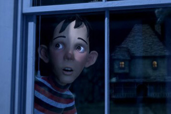
The character designs in Monster House are uninteresting and unappealing. They are very bland and that comes from generic, even proportion. I've seen a lot of this in my short time as an animation student, but they are basically normal human proportions with slightly enlarged heads, hands and eyes; plus all the facial features are the same size and are evenly placed on the head.

Another hot topic was appeal. A lot of people have said that the characters in Happy Feet had appeal, but I completely disagree with that. Many artists confuse appeal with cuteness. CUTENESS HAS NOTHING TO DO WITH APPEAL! Appeal really just means anything that a person likes to look at, but it also includes pleasing, simple design. (This stuff is in "The Illusion of Life," by the way) The photorealism and over-complexity of the Happy Feet penguins are appeal-killers. When I think of appeal, I think of thoughtfully designed characters with interesting body shapes. Really shapey stuff like Yogi Bear, Mr. Incredible, Looney Tunes, or Monsters Inc. That stuff has simple, shape-based design, and would be a lot of fun to animate.


More on this as it develops!
posted by TP at 9:32 AM
![]()
0 Comments:
Post a Comment
<< Home