Thursday, March 29, 2007

Creating Characters with... Personality?


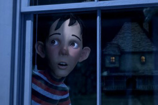
Man, I cannot stand this book. If you google Tom Bancroft, you will find some good art, but none of it is in this book. This stuff is so unappealing. In reading it, I felt like most of the designs had really even proportion, and were all basically the same. I mean, look at the cover. That kid's eyes, nose and mouth are all the same size and are evenly spaced. Also, is head, hands and feet are exactly the same size. And I really hate those Mega-Man type feet where it just starts from the knee and spreads out with no ankle...
I AM NOT TRYING TO BASH TOM BANCROFT! The man can draw... he has a cool blog too... but I just CAN'T stand this book. The thing that really irritates me is that this book was REQUIRED for one of my classes. I took one look at it and said no thanks. There are some people at my school that absolutely love this book. They can't get enough of it... I don't get it guys... Here's where I like to go to look at really well designed characters:

http://characterdesign.blogspot.com/
Preston Blair
http://johnkstuff.blogspot.com/
http://stephensilver.blogspot.com/

Saturday, March 24, 2007

a peek into the future...


here's a sneak peek into my latest thesis attempt...
i can't say much but i will say this: hang glider test pilot.
more to come soon!

Labels:

Saturday, March 10, 2007

Monster Hizzouse

Hello all! There's been some pretty cool discussion lately on the school forums about some recent "animated" movies. Most recently: Monster House character design. I've been putting my 2 cents in on the forum, but some really cool stuff came up and I figured it was blog-worthy.

The character designs in Monster House are uninteresting and unappealing. They are very bland and that comes from generic, even proportion. I've seen a lot of this in my short time as an animation student, but they are basically normal human proportions with slightly enlarged heads, hands and eyes; plus all the facial features are the same size and are evenly placed on the head.


Another hot topic was appeal. A lot of people have said that the characters in Happy Feet had appeal, but I completely disagree with that. Many artists confuse appeal with cuteness. CUTENESS HAS NOTHING TO DO WITH APPEAL! Appeal really just means anything that a person likes to look at, but it also includes pleasing, simple design. (This stuff is in "The Illusion of Life," by the way) The photorealism and over-complexity of the Happy Feet penguins are appeal-killers. When I think of appeal, I think of thoughtfully designed characters with interesting body shapes. Really shapey stuff like Yogi Bear, Mr. Incredible, Looney Tunes, or Monsters Inc. That stuff has simple, shape-based design, and would be a lot of fun to animate.


More on this as it develops!